RMX Direct was officially released from beta this morning. In our beta testing we proved one thing - that RMX Direct works at making publishers more money. Now, we are ready to help any and all publishers with that challenge.
It's going to be an exciting day! Just check out the buzz:
Monday, January 29, 2007
Saturday, January 27, 2007
New RMX Direct Website (still in beta)
I wish I had a screen shot to show how the old website looked, but take a gander at the new RMX Direct website! It took a lot of work from a lot of people to get it all done!

Special thanks to:
Special thanks to:
- Pat McCarthy
- Cam McNeeley (no relation to me)
- Shane Foster
- Brad Nelson
- Vince Panero
- Jerri Gillean
- The Horn Group
- Christine Hunsicker
- the RMX Direct PHP developers
- Luke Walsh and Becca Bullack for the case studies
- and anyone else I forgot (email me if I missed you)
Oregon Federation Of College Democrats
This was another volunteer project. The Oregon Federation of College Democrats came to me in need to a website/blog and they wanted me to design it. I was happy to help them out. It's been a while since the Dems have posted to the blog - but I'm told they will be ramping it up with the elections coming soon.

Friday, January 26, 2007
University of Oregon Alpha Mail Redux
The University of Oregon really gets my goat...
First, they choose not to become the flagship university using Gmail. OK, I fought that fight hard, but lost. I can live with that. The smart strategists over at the Daily Emerald suggested Google's program wouldn't work for a school as big as UO (and our 20,000 students). I guess ASU (and their 65,000 students) didn't get the memo. Nice job Sun Devils.
Next, I tried to help out where I could by offering to redesign Alpha Mail, the University's new open source email program, which is supposed to be their answer for Gmail. It's funny, UO liked Gmail so much they copied it's UI. In the end, it was all a big waste of time... the developer of Alpha mail has moved on, and yet again, the students at UO have an inferior email client because of the poor long term decision making of the UO administration.
Original (and current) Alpha Mail Login:

Alpha Mail Login Redux:


There were some crazy design constraints with this... Apparently UO was trying to develop this system so a bunch of universities could use it and "fight off" gmail (seriously). So the design had to be one that could be used by multiple schools. I tried to keep everything simple, because it's just an email login page - how complicated does it need to be? I've put up several designs, to show how flexibility of the design.
First, they choose not to become the flagship university using Gmail. OK, I fought that fight hard, but lost. I can live with that. The smart strategists over at the Daily Emerald suggested Google's program wouldn't work for a school as big as UO (and our 20,000 students). I guess ASU (and their 65,000 students) didn't get the memo. Nice job Sun Devils.
Next, I tried to help out where I could by offering to redesign Alpha Mail, the University's new open source email program, which is supposed to be their answer for Gmail. It's funny, UO liked Gmail so much they copied it's UI. In the end, it was all a big waste of time... the developer of Alpha mail has moved on, and yet again, the students at UO have an inferior email client because of the poor long term decision making of the UO administration.
Original (and current) Alpha Mail Login:
Alpha Mail Login Redux:
There were some crazy design constraints with this... Apparently UO was trying to develop this system so a bunch of universities could use it and "fight off" gmail (seriously). So the design had to be one that could be used by multiple schools. I tried to keep everything simple, because it's just an email login page - how complicated does it need to be? I've put up several designs, to show how flexibility of the design.
Fanconi Redux
The Fanconi Anemia Research Fund is a great little non-profit located here in Eugene, Oregon. They've been doing some great work for a lot of years on an important medical condition.
I took up the design project at the suggestion of Dave Frohnmayer. Although the design was never implemented, I was happy to do my part in trying to help where I could.
Original Fanconi (and current design):

Fanconi Redux:

Basically, I was instructed to keep the same layout/look and feel to the site - but just to update and refresh. I focused on changing from the three column layout down to two, and cleaning up the color scheme and navigation. Also, because a lot of Fanconi's traffic was from out of the USA, I made it text based as much as possible (for ADA too).
I took up the design project at the suggestion of Dave Frohnmayer. Although the design was never implemented, I was happy to do my part in trying to help where I could.
Original Fanconi (and current design):
Fanconi Redux:
Basically, I was instructed to keep the same layout/look and feel to the site - but just to update and refresh. I focused on changing from the three column layout down to two, and cleaning up the color scheme and navigation. Also, because a lot of Fanconi's traffic was from out of the USA, I made it text based as much as possible (for ADA too).
Monday, August 07, 2006
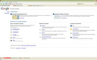
Google Business Solutions Updated
There are no huge changes, but the design and content layout of Google Business Solutions has changed.

Already having changed Google Sitemaps to Google Webmaster Central, it seems that the bees in Mountain View have been very busy.

Already having changed Google Sitemaps to Google Webmaster Central, it seems that the bees in Mountain View have been very busy.
Subscribe to:
Comments (Atom)

